When editors destroy the layout - Why does my CMS look so crappy after a short time?
As an editor with extensive access and editing rights, you should know the design guidelines of your project in your sleep: Aspect ratio for page layout X, breakpoints for various viewports, text formatting and co. ideally result in a uniform overall picture that represents the Corporate Identity (CI) of the company in print and online media in a target group-oriented manner.
Sounds like a lot of responsibility? It is! Unfortunately, experience shows that it is much easier not to adhere to layout-based guidelines instead of following the strict rules of the style guide - perhaps also because you simply don't know them well enough, in case of doubt for the accused. So here are a few tips and tricks from everyday editorial life, so as not to risk your friendship with the dear frontend designers (at this point, a dear greeting to the second floor!).
Style guide - can you eat it?!
No, the style guide is your best friend: Even if it's sometimes a bit exhausting with it, you know you can always rely on it - and you definitely can't do without it.

That's because the style guide is the basis of a uniform company presence and is meticulously designed in collaboration with a wide variety of trades from online and print at the start of a project (and dutifully expanded when new elements are created). The goal is for editors to know all design guidelines and layout specifications described here down to the last detail.
We therefore urge everyone responsible for a project to address this issue at the beginning of the project and to take the (admittedly long) time to conceive and design such a virtual reference work in a team and to constantly update it during the course of the project. In the long run, it helps immensely in the day-to-day editorial work as well as frontend development, especially when new colleagues join a project.
Only with the comprehensive guidelines of a style guide can the visual page formatting be defined in order to prevent the following popular mistakes made by editors.*
Mistake #1
The world thinks: "Desktop first"
Nowadays, more and more people visit a website via their smartphone. It is therefore essential for an optimal user experience to develop a website in the so-called "Responsive Web Design", because different devices influence the display and usability of a website. The design concept therefore always follows the "mobile first" approach: it starts with the smallest device and ends with the largest, the web browser.
Most of our daily editorial work takes place in the desktop view, i.e. we work on the laptop and create new content for our users. In the process, we tend to lose sight of the fact that the new content should not only look good on the laptop, but also on mobile devices.

Particularly critical here are, for example, self-made tables in the RTE, which are pushed over each other in smaller breakpoints, or elements arranged in several columns and rows in the desktop view, which are displayed in the wrong order in the mobile view, because no enclosing containers were used. Also a pearl: insert line breaks until the text-image arrangement in the desktop view is coherent - on the smartphone we then simply have a large gap. #why
Our tip: Anything not developed in the style guide should not be tinkered with manually on your own - it's known that things always crash at some careless point. If new design requirements arise in the editorial work, the next step is a meeting with the frontend development team.
Mistake #2
Photo editor: "Aspect Ratio helps with headaches, right?"
Appealing content doesn't just consist of never ending text, but is skillfully enhanced with good, high-quality photos. When several editors are responsible for new content, many different opinions, divergent tastes and creative minds come together. It can therefore be assumed that everyone will develop their own style for an article structure in the shortest possible time and that an overarching formal language will quickly no longer be conveyed.

This should be countered on the one hand by defining a standardized structure for an article in the editorial handbook and on the other hand by limiting the free choice of images through fixed formats as well as selection criteria for image editing. Images with high color contrast should always be chosen, with the main motif centered in the focus - we remember the keyword: optimal display on mobile devices.
Selecting images with the right aspect ratio is part of the 1×1 of print and online editorial work. Image-to-text ratios play just as important a role here as different column arrangements.
Please avoid a classic faux pas at all costs: Never place an image in portrait format next to a landscape in columns. This was certainly never intended in a 50/50 or 33/33/33 element designed by the frontend developer and can therefore only appear strange to the user.
Mistake #3
Free image choice: Stock photos are the new art design
The supposed problem with this is the fact that good photos also cost good money and, unfortunately, not every editorial team wants to or can invest in a high-quality content pool from a graphic designer. At this point (unfortunately) people like to save money and hastily fall back on free (unfortunately often boring-looking) stock photos that only trigger a few emotions (the classic: "smiling blonde woman with headset" next to the contact address).
This is not to degrade any stock photos - we often use them ourselves. We just want to say that unique content is always better received than static-looking, freely available stock photographs. Let's continue...

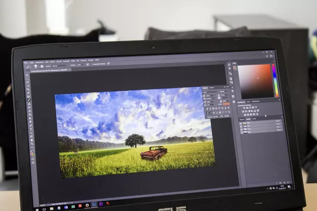
Here it is always to be considered that possibly many other competitors have identical motives in use, whereby individuality points with the reader could be lost - after all one knows the picture already from numerous other sides and is little surprised to see again the broad grin of the blond lady with a headset. In addition, time often has to be invested in time-consuming Photoshop post-processing in order to achieve the desired color contrast, cropping or the like.
Here, the editorial team should weigh up how "unique" the content should be and draw the appropriate conclusions.
Tip: It is essential to create an editorial plan and update it regularly (at an early stage) in order to be the first editorial team with fresh content and up-to-date images at the start and in the SERPs. Also: If the content of your own website(s) relates to areas such as lifestyle or fashion, you should definitely consider purchasing a decent camera - self-shot images look more authentic.
Mistake #4
More is more: The revival of Word Clipart and Corel Draw
Who doesn't remember the colorful ideal world of "Word Clipart" and "Corel Draw". Even in the TYPO3 backend there are daring RTE functions that allow editors to apply old clipart skills directly to the web: Colorful fonts, different font types and sizes or curiously integrated images are just the beginning here.
In order to remain true to the CI, a uniform form language is defined in the style guide at the start of the project: Every button, every link and every word has a standardized look that is best aligned with the company's target group. Only these formatting options should be available for editors to choose from in the backend, so that there can be no misunderstandings or creative excesses here at any time. We have therefore always set the RTE functions to "Default" and add our individually developed classes and frames to each project.
Tip: Watch out for formatted text, it can have negative effects on the frontend output. If you want to copy and paste text passages, you are welcome to do so - but please delete the formatting beforehand, for example in a text editor.
Conclusion
...without a style guide it really doesn't work, because web design by the editorial team on its own can only really lead to the goal in the rarest of cases. In the best case, the editorial team and frontend development are a well-coordinated team that works together to create a unique browsing experience for website visitors on all devices: a coherent design layout with a consistent form language and meaningful images.
What problems do you encounter in your daily editorial work? Feel free to write us your experiences in the comments!
*Yes, we don't exclude ourselves here either - after all, you learn from your mistakes. 🙂
Read more about this topic in the blog post "The 7 deadly sins of the TYPO3 editor".
Please feel free to share this article.

Comments
No comments yet.