The 7 deadly sins of the TYPO3 editor
Let's imagine the following situation: We're sitting at work when suddenly a client surprises us by mail, phone or ticket system with an editorial customization request. As experienced TYPO3 editors, we've of course done this kind of thing 1,000,000 times before - so we open the corresponding TYPO3 backend in full throttle to carry out the desired customization quickly and elegantly. We search for the desired page in the page tree, quickly click and...
... endless miles of unnamed content elements appear on the page. In at least seven localizations, of course. Which we now ALL. ONE. AFTER. THE. OTHER. CLICK. THROUGH. TO. FIND. THE. RIGHT. ONE. That's it. I'm leaving.
To (hopefully) save us and you from such and similar situations in the future, here is a short overview of the 7 deadly sins of the TYPO3 editor, which no editor should ever do. At least not if you don't hate your fellow human beings.
Sin 1: Create content elements without a name

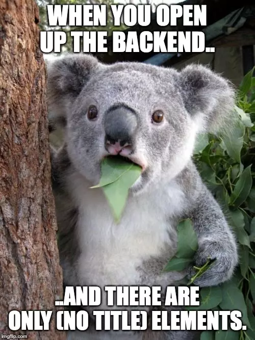
As the cute koala on the picture already tells: Please do not create content elements without giving them a name. Please. Not even on pages with little content. Otherwise, TYPO3 will simply set the text which is written in the text field of text-elements or text-image elements as "headline". And that quickly becomes confusing. The same applies to the localization of content elements. By default, TYPO3 simply puts in (copy 1).
Just do yourself a favor: Give it a name. Otherwise, in 1-2 years, no one will know which content element contains what. And if one of these elements is to be edited, there will be a lot of screaming.
Sin 2: Upload an image in the content element
Listen: There is a super handy file management system that is directly integrated into TYPO3: The FAL. There, you can easily sort and collect all documents and files you need on your website in specific folders. If you are looking for a specific document, you will find it quickly and easily thanks to the logical folder structure. At least that's the theory.
Unfortunately, the reality is often different: If you upload a file directly via the content element, it does not automatically end up in the correct folder, but in user_uploads. And once it's there, you can actually just shoot yourself in the foot. You will never find it again if you have more than 100 files in the system. In reality, this phenomenon is further complicated by the fact that some documents are adjusted annually/monthly/quarterly and uploaded as a new file. The outdated documents are then usually not deleted, so that there are then - in good cases - 6 to 20 versions of a file with identical file names.
Our tip: If you are in the process of relaunching an existing TYPO3 installation - make sure to do a cleanup of the file list. Otherwise you'll just keep dragging the old stuff with you. Unfortunately, it is almost impossible to establish an organized folder structure afterwards. If you start with a fresh TYPO3 - take your time and set up a proper folder structure in the FAL. What seems to be tedious and time consuming at first, will save you lots of hours of work and searching in the long run.
Sin 3: Matching number 2 - embedding images in the RTE
Yes, you can configure the ck_editor to allow you to insert images directly into the text. However, we strongly advise against this. Even though this may seem the simplest option at first glance - you can achieve the same thing with a simple image-text element. But technically clean.
Because if the content has to be migrated later on, you will run into problems when using images in the RTE. Also: images in the RTE cannot be provided with meta data and therefore also have SEO-technical disadvantages. An alt tag, for example, is essential for the accessibility of a website.
Sin 5: H3, H1, bold, colored and underlined - end boss: semantics
The semantics of the page content is crucial and should not be disregarded. As a rule, 3 to 4 types of headings are defined for a web page, each of which is called H1-H4 and differs in font size, boldness and, if necessary, even font type. Actually, their structure is self-explanatory:
H1: Most important heading
Every page should have a H1 heading that represents the main topic of the page.
H2: Second most important heading
H2 headings are logically the sub-headers that deal with sub-topics to the main topic.
H3: Third most important heading
H3 headings are therefore the headers that are used for subtopics of the subtopics.
H4...
I think you understand what I am getting at. But why should you stick to such a heading hierarchy? After all, you can just underline things that are important, randomly bold them, or change the font size.
First, a clear, visual division of content makes it easier for visitors to absorb the information. None of us likes to read long, small-print texts just to find a specific piece of information. With the right structure, you enable your users to scan the content directly and find the information they are looking for in the thematically appropriate section. Besides, a page with an organized structure always looks more professional than one with a lot of text, a few bolding and underlining here and there, and colored dots.
Second, the semantics of a page also has great importance for SEO. By using the different h-tags you can tell the search engines which content is important and which is less important. Search engines evaluate the headings from H1 to H6 with decreasing importance. So, ideally, there should be a single H1 heading per page, followed by semantically correct H2-H4 headings.
Sin 6: More color is not always better
There will be a separate blog article about this soon: "When editors destroy the layout - Why does my CMS look so crappy after a short time?" But more about that later on.
For most TYPO3 installations you define a style guide (unless you already have one) and specify how content elements can and should look like. Based on this, the corresponding content elements are then developed and made accessible to the editors in the backend.
However, if the editors are not properly trained, or if there is no "guideline" for the correct use of the content elements, it can easily happen that different pages on a website not only do not have the same structure, but are also sometimes "dubiously" designed. According to the motto: "Cool, now a yellow box and the content will definitely look really catchy."
Sin 7: When deleting, the following applies: When in doubt, better ask twice...
...because once the page is deleted, it takes a lot of effort to undo the deletion. You can avoid this and save us the trouble as well. As an editor in TYPO3 you always have the possibility to hide a page - or a single content element (keywords: hide in menu / disable). Because usually there is rarely the need to delete a page completely right away.
By the way: Every now and then you hear that TYPO3 is so terribly user-unfriendly. Well, sometimes it's just the person sitting in front of the screen who is the problem. If you stick to the possibilities and functionalities given by TYPO3, you will have a very clean and structured content management system at your side.
Here is the link to the mentioned blog post "When editors destroy the layout - Why does my CMS look so crappy after a short time?"
Please feel free to share this article.
Comments
No comments yet.