Marketing Factory goes TYPO3 Version 11
Good things come to those who wait (or rather start doing) 🙂
Which digital agency doesn't know the situation - you run a TYPO3 installation, care for it, and in the end, you never have time for the actually important and necessary upgrade to the latest version.
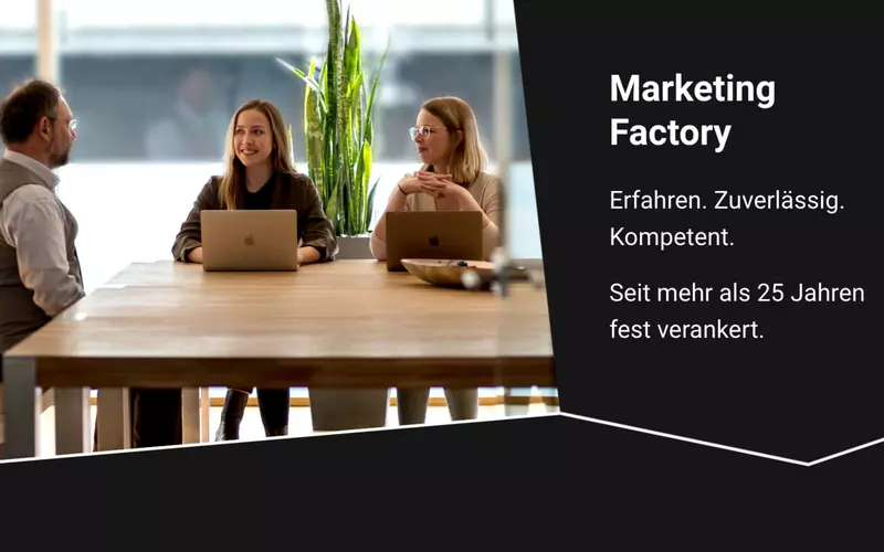
Last year we took up the challenge to update our own website besides working on our customer projects. And we did not only focus on the purely technical upgrade to the new TYPO3 version 11, but also tackled a visual relaunch. And now we can say: It was worth it!
For more than a year, a small team of MFC has been working on the project. We closely examined and analyzed the previous concept and visual appearance of our website, defined new concepts and worked out new approaches. After the fundamental questions, structures and goals were answered and outlined, we started with the implementation.
The foundation of our project was a frontend prototype, which we had lovingly created beforehand and which visualized our ideas. This simplified the development of a concept, the joint exchange, as well as the creation of a holistic CI quite a bit. The advantages of such a prototype are: creating, maintaining and updating it requires significantly less resources and work than, for example, setting up an entire TYPO3 installation for such a task.
Step by step reaching our goal
The first step: Setting up a new and completely empty TYPO3 installation with TYPO3 version 11. Up to now, we still used a version 8 (yes, with ELTS - we know). That's why we wanted to start from scratch: Implement and use the individual steps of the concept in sprint weeks and leave everything outdated behind.
So we set up a new TYPO3 11 with PHP version 8 - long loading and waiting times were a thing of the past. The backend is now faster than ever before, which makes maintenance and working in the backend much more comfortable. In addition, we installed the Bootstrap package, which provides us with the initial basis for layout and content elements. After the base was in place, it was time for customization.
Black or white? We say: both is possible!
One of the special features of our new layout is the ability to switch between Light and Dark Mode. Two designs in one – the users can decide whether they prefer our website in light or dark.
But of course that's not the only highlight of our new MFC website: In addition to an entirely new page structure, content and images, we have concentrated particularly on editor-friendly content elements. And we created a comprehensive and detailled presentation of our references, with a special focus on target groups.
In addition, we have combined two CMS with each other: TYPO3 meets WordPress. We now give a more prominent role to our MFC blog on the website. On individual pages and in the context of our references, related blog articles and tags will be linked via symbols from now on, so that one can deal with certain topics faster and more directly.
What next?
Of course we will continue to work diligently on our website, some tasks and ideas are still awaiting an implementation. But the first big step is done: our new website is live.
During this project, we learned a lot, experimented with new things and deliberately did things differently. We will report about this in the upcoming blog series about our new website and give you some insights into the conception and implementation on the following topics (order is not binding):
- MFC in relaunch fever: best practices for a new design and how to ease your way through the concept phase
- From the engine room: our tech stack: what do we use and what do we rely on?
- TYPO3 meets WordPress: we connect two CMS
- No more upgrades: we rely on Continuous Upgrade
- Our experience with the new TYPO3 version 11
- Custom Elements: what makes our site special?
- Our centerpiece: customer references with new design & functionalities
- UX in the backend: small adjustments that make editors happy
- SEO is the key: ways to optimize
- Hello Matomo! We introduce a new analytics tool
And to make sure we never face having to make such an extensive upgrade again, we are also relying on the Continuous Upgrade concept for our own website. This will save us a lot of work in the future and allow us to devote even more time to our customers.
If you want to get an impression of our new website, you are welcome to take a look here.
Please feel free to share this article.
Comments
No comments yet.