![[Translate to English:] Image collage: on the left side wooden letters as a symbol for the Gutenberg editor of WordPress; on the right side a young woman from the TYPO3 press material for version 9](/fileadmin/_processed_/b/3/csm_gutenberg-vs-typo3_8a4611d468.webp)
Gutenberg vs. TYPO3 Content Elements
As a TYPO3 Gold Member, active member of the TYPO3 Community and longtime TYPO3 specialist and enthusiast, most of our projects are executed using TYPO3 as their content management system. However, we are also using WordPress for smaller websites and corporate blogs – just like this one 😉 (edit 01/2023: our blog now runs with TYPO3 – read here why we decided to make the switch after 12 years).
There are lots of pros and cons for both systems and when deciding to create a website customers should carefully deliberate about whether using TYPO3 or WordPress. We’ve already touched on that subject in an older blogpost if you are interested in learning more about our stand on that.
One of the main reasons why lots of people prefer WordPress over TYPO3 is the alleged simpler and more intuitive editing experience in the backend. With WordPress’s new editor Gutenberg – which is now available with version 5.0 – this is supposed to improve even further.
Gutenberg – the new Backend Editing Experience
Gutenberg is WordPress’s new content editor and fully integrated into WordPress since the publication of version 5.0 on 6th December 2018. But Gutenberg isn’t just an editor. It’s a PageBuilder, which means, that you can’t only use it to create and edit content, but also to add pictures, layouts and lots of other elements. People were able to test out Gutenberg before its official release as a beta version with installations upwards from version 4.2. It is now completely integrated into WordPress 5.0 and will take over as WordPress’s new standard editor. If you want to keep on using the standard editor, you can still do that with the usage of an extra plugin.
Gutenberg’s main goal is to simplify content development and editing for everyone – especially people without any HTML or CSS knowledge. Everyone should be enabled to create creatively designed posts and pages. Therefore, all of the content is created using blocks.

Blocks can be basically anything from basic text elements to pictures, galleries or even buttons and can be rearranged anyhow at any time. Blocks can also easily be duplicated or moved around. Additionally, editors are able to create their own blocks and reuse them again and again anywhere on the page.
There’s a special promo page where you are able to try blocks, even when you’re not using WordPress actively. For anyone interested: Gutenberg, the new editor.
Gutenberg is especially suitable for web rookies without deeper experiences in web anything as well as for editors wanting to edit both – content and design – at once. The overarching backend editing provides editors with a true „what you see is what you get“ experience. No more switching between front- and backend needed – enabling a faster, simpler working experience.
Everyone who’s already working with WordPress and is using a different PageBuilder should be aware about the fact, that contents won’t be migrated automatically and might need to be rebuild completely from scratch.

Content Editing with TYPO3 Content Elements
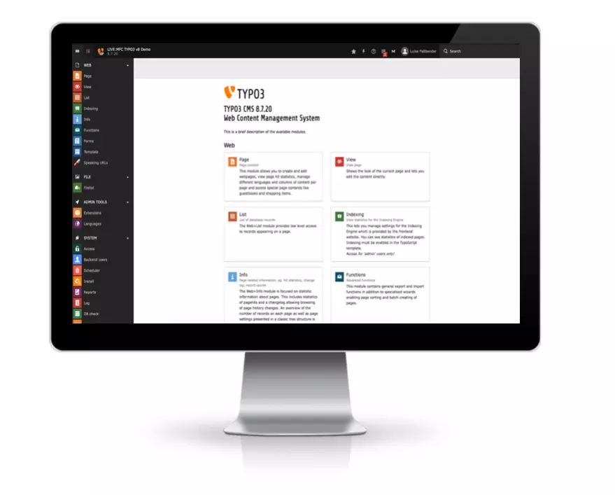
The overall content editing experience in TYPO3’s backend has immensely improved with the release of version 7.6 LTS, which redesigned the backend completely. Features like drag & drop or copy & paste enable a more intuitive editing. Big, colorful icons took over the confusing looking module view and generate a cleaner workspace.
In TYPO3, content is created and edited using content elements. When creating a new content element, editors can choose between different types of content elements: text, text & images, multimedia, HTML code, plugins, galleries, file links etc.. The different types of content elements are usually defined during the setup of an installation. Though, new content elements can also simply be created and integrated at any given point in time.
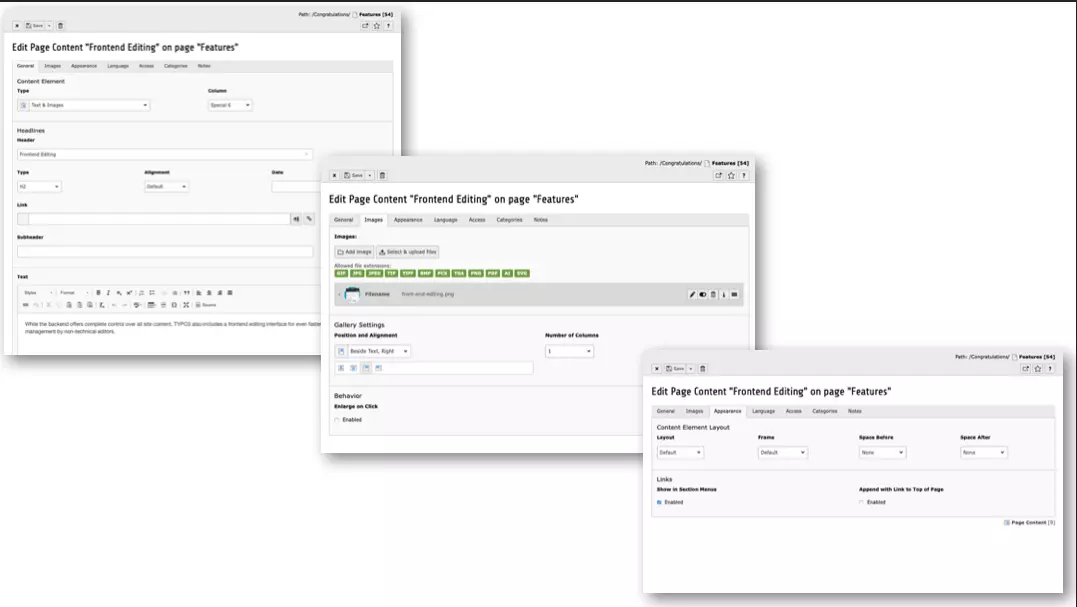
If an editor creates a text & images element, he can directly influence the contents‘ behaviour in the frontend by changing different parameters in the „appearance“-tab. These possible behaviours obviously need to be defined in the template before being available for use.
Editors have the possibility to change / edit:
- page layout,
- spacing before and after an element,
- background colours of different paragraphs,
- frames,
- positioning text relative to image(s)
and so much more individually. So editors do have some creative freedom in TYPO3– at least to a certain degree.
When directly comparing TYPO3’s content elements to Gutenberg the main difference is that editors are not able to edit the whole page at once, but only single content elements. Hence why editors have to switch back and forth between different content elements in order to edit different sections of the website. This „problem“ however was solved with the introduction of the frontend editing extension which enables – as the name suggests 😉 – frontend editing for TYPO3 v8 and v9.
What needs to be noted here is, that TYPO3 offers an actual frontend editing and not just a „frontend editing experience in the backend“. The user is able to place the content element right where it is supposed to sit later on. There’s also the possibility to check the final layout on different devices with a simple click of a button in the right menue.
Final Conclusion
All in all, Gutenberg’s approach can be compared to TYPO3’s grid elements pretty well. Both approaches give designers the opportunity to create the overall „design framework“ while limiting the editors creative freedom. The editors on the other hand do have the opportunity to express a certain degree of creativity when using blocks or grid elements – within the previously set boundaries. They can choose different types of content elements, frames, layouts and even colors. Both content management systems have their pros and cons.
In TYPO3 every content element gets a single entry into the data base and can be reused using „insert records“ everywhere. Comprehensive content therefore only needs to be created once and can be reused arbitrarly often anywhere on the website. In Gutenberg however, all contents of a page / post are stored within a single data base entry.
Fundamentally: Both systems are aiming for totally different approaches to content management.
- Gutenberg provides the editors with a frontend editing experience in the backend. The editor can focus solely on design & content without having to switch between different elements.
- TYPO3 on the other hand primarily focusses on providing a clean and structured way for managing content. The layout / design approach just isn’t as important. Still, the frontend editing extension enables the editing of content directly in the frontend.
Ultimately it’s all a matter of taste anyway … 😉
Special thanks to Simon for his technical input on this topic!
Please feel free to share this article.


Comments
No comments yet.